Color

Rooted in history and future facing, our color system revolves around a primary, secondary, and neutrals palette. Each palette works alongside the others to foster brand recognition and create flexibility and consistency across our compositions. 

Primary Palette

The primary palette balances warm white with recognizable Emory blue and yellow. Additional values of blue and gold add depth and richness to the core colors. 

Emory Blue

Emory Blue

PMS 294
CMYK: 100/74/0/45 (coated)
CMYK: 100/68/0/21 (uncoated)
RGB: 0/47/108
HEX: #002F6C

Emory Yellow

Emory Yellow

PMS 130
CMYK: 0/32/100/0
RGB: 242/169/0
HEX: #F2A900

Dogwood White

Dogwood White

CMYK: 0/0/0/3
RGB: 246/246/246
HEX: #F6F6F6

WaterHub Blue

WaterHub Blue

PMS 286
CMYK: 100/75/0/0
RGB: 0/51/160
HEX: #0033A0

Secondary Palette

The secondary palette is inspired by natural and architectural elements from the Emory campus and provides hues that balance with the primary palette. These are primarily used in instances where direct brand linkage is less crucial. 

Heritage

Eagle Blue

Eagle Blue

PMS 289
CMYK: 100/76/12/70
RGB: 12/35/64
#0C2340

Scepter Gold

Scepter Gold

PMS 125
CMYK: 6/32/100/24
RGB: 181/133/0
#B58500

Vibrant

Candler Lake

Candler Lake

PMS 7461
CMYK: 98/24/1/3
RGB: 0/125/186
HEX: #007DBA

Wise Heart

Wise Heart

PMS 7597
CMYK: 0/85/95/2
RGB: 209/65/36
HEX: #D14124

Lullwater

Lullwater

PMS 3537
CMYK: 100/14/99/65
RGB: 0/72/43
HEX: #00482B

Dusk

Dusk

PMS 7673
CMYK: 73/67/4/12
RGB: 83/84/134
#535486

Fresh

Marble

Marble

PMS 691
CMYK: 0/14/5/1
RGB: 233/205/208
HEX: #E9CDD0

Wisteria

Wisteria

PMS 2635
CMYK: 20/27/0/0
RGB: 200/181/241
HEX: #C8B8F1

Spring

Spring

PMS 604
CMYK: 5/0/88/0
RGB: 236/221/49
HEX: #ECDD31

Oxford Farm

Oxford Farm

PMS 7496
CMYK: 35/0/100/37
RGB: 119/137/33
#778921

Neutrals Palette

The neutrals palette is composed of shades for backgrounds in digital environments.

  • Emory blue 10%
  • Emory yellow 10%
  • WaterHub blue 10%

We use Emory blue, Emory yellow, and WaterHub blue at 10 percent as a background.

Emory Blue 10%

Emory Blue 10%

PMS 294 (10% TINT)
CMYK: 9/6/2/0
RGB: 228/231/239
HEX: #E4E7EF

Emory Yellow 10%

Emory Yellow 10%

PMS 130 (10% TINT)
CMYK: 0/2/9/0
RGB: 254/246/230
HEX: #FEF6E6

WaterHub Blue 10%

WaterHub Blue 10%

PMS 286 (10% TINT)
CMYK: 8/7/0/0
RGB: 231/231/245
HEX: #E7E7F5

One-Color Printing

Any variation between white and black should be used in one-color reproductions.

Primary Palette Color in Use

Negative Space

Negative space is central to our brand. It gives it airy confidence and sophistication. Across most compositions, the largest proportion of color should be Dogwood White.

Primary palette examples

Building Color

The primary palette should be introduced in a specific order to keep the Emory brand identifiable and differentiated. Warm white, Emory blue, and yellow are the most critical values and must take priority in each composition.

Building color example

Building Color Exceptions

For formal pieces, such as an annual report, alumni invitation, or government document, dark blue may be prioritized over Emory or WaterHub blue. To communicate a more energetic vibe, WaterHub blue can be prioritized.

Color exceptions examples

Background Colors

A high proportion of pieces should use warm white backgrounds to create the sophisticated, airy compositions that define our visual style. Roughly 80 percent of backgrounds use warm white backgrounds or are full-bleed photography.

Background colors examples

Secondary Palette Color in Use

Social media

The secondary palette helps provide visual variety among a high quantity of visual materials

sample social media post

Emory organizations and events

The secondary palette helps differentiate sub-brands and initiatives within the Emory community.

sample poster

Merchandise/SWAG

Used in specific moments to organize and emphasize text.

sample swag bag

Data Visualization

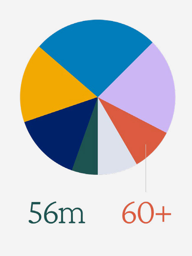
Data visualization uses both the primary and secondary palettes to illustrate complex ideas and create meaning.

sample chart

Proportional Usage

Use warm white backgrounds or full-color photography that incorporates colors from our accent palette in order to create compositions with limited but lively colors.   

20% 

Accent colors should account for less than 20 percent of color usage in any given piece. 

Color in Use Accessibility

Accent Palette

An important part of accessibility is the use of color and contrast. As we apply color throughout our visual system, it is important to ensure that it does not impact the legibility of crucial information. 

Accent palette examples

Color Palette Misuse

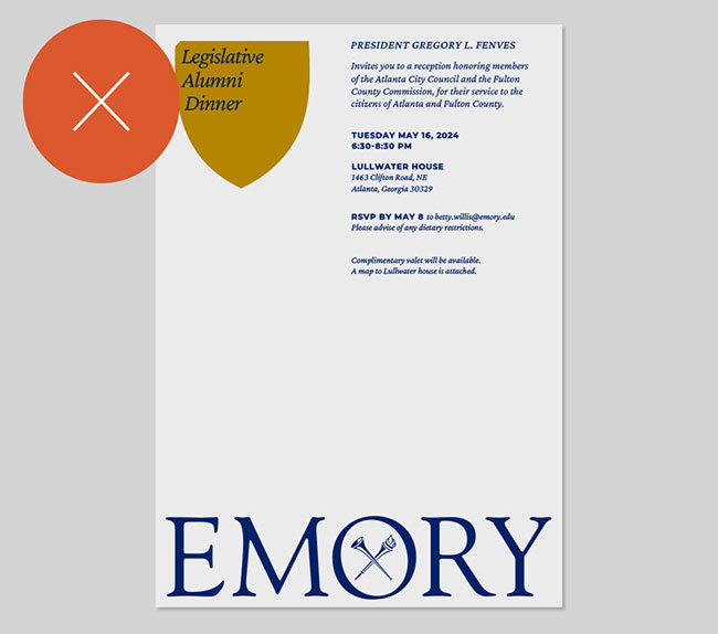
Do not use gold and any shade of blue without Emory yellow present. The navy and gold color combination begins to feel similar to colors used by other institutions.

Do not use any brand graphic element in the secondary palette. These must use the primary Emory palette.

Do not use colors from the secondary palette as the background for more than 33 percent of the composition.

Do not use color combinations that do not provide enough contrast or harm legibility.

Do not frequently use blue as a background. A blue background should not be used more than 30 percent of the Time.

Questions?
Contact the Communications and Marketing brand team.
emory.branding@emory.edu