An important element that helps the Emory brand stand out is the way everything comes together. Following a few key composition principles helps our layouts feel consistent yet unique and creates cohesion across all pieces of communication.
Best Practices
Emory layouts are dominated by clean and smart use of negative space. Giving all design elements room to breathe instills quiet confidence in a layout. Regardless of media, placement, or type, every piece of our communications has a simple, clear hierarchy that helps our audiences easily understand information.
Our layouts are characterized by the following principles:
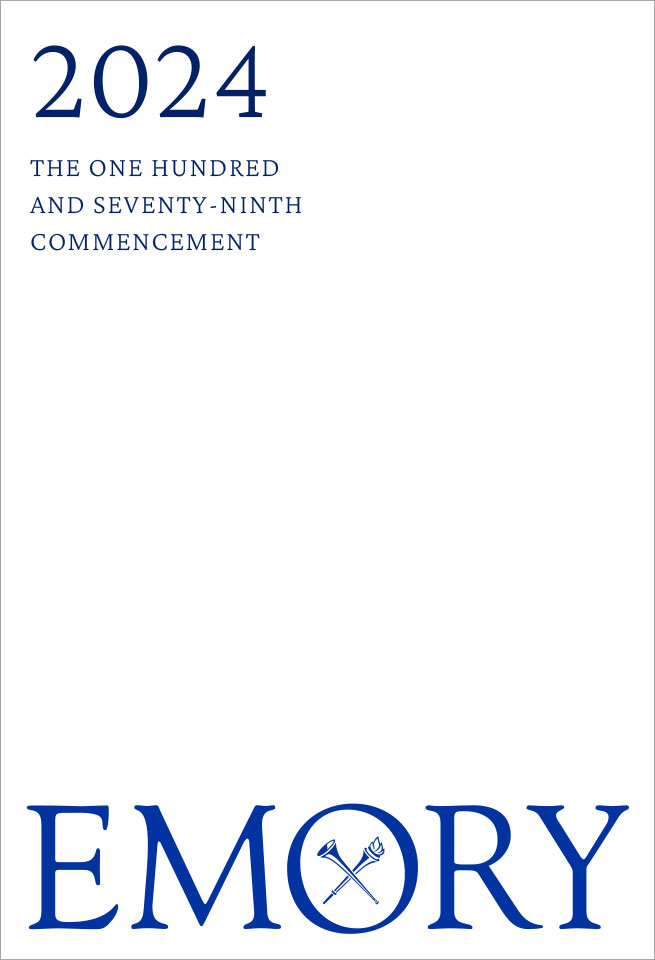
01. Restraint and Negative Space
This is perhaps the most important aspect that makes the Emory brand distinct and set apart. Using restraint and balancing elements creates quiet, elegant confidence.
02. Curiosity
We want our layouts to echo how we view the world—through an informed and unexpected lens. Layouts should include a very light touch of experimentation that adds a small moment of delight for our audiences. In this example, a short piece of type is set vertically.

03. Thoughtfulness and Quality
The overarching goal of every piece of communication is, first and foremost, clarity. Clean, consistent organization and hierarchy are present in every piece that bears the Emory name. And the addition of an inquisitive element should never impede clarity.
Using Negative Space
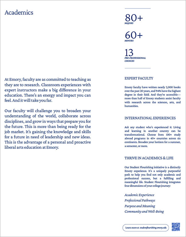
Every visual in this document is an example of using negative space and allowing design elements to balance and breathe. While balancing positive and negative space can be highly subjective, a good proportion to keep in mind is 40 percent design elements : 60 percent negative space.
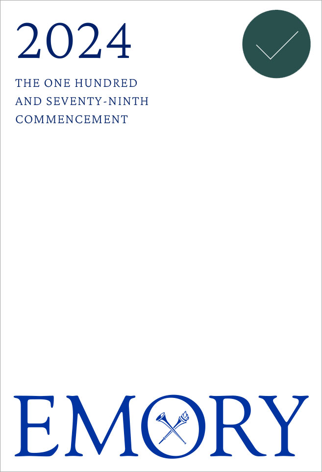
This example uses roughly 40 percent design elements and 60 percent negative space. The colors balance in a way that lets the Emory logo be the hero.
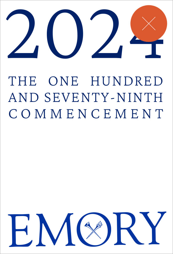
In this example, negative space is only about 25 percent of the composition. The scale of “2024” competes with the Emory logo.

Here the negative space is roughly 85 percent of the composition, and the scale of the content doesn’t deliver presence.

In this example, the design elements are not treated in a way that makes them feel unique. Treating design elements too simply can make them feel standard or underwhelming and, in some cases, look like a mistake.
Photography
A composition that uses a full-bleed photo should adhere to this same principle, 40 percent design elements : 60 percent negative space.

Negative space is not always a white or solid background. A full-bleed image can also act as negative space in a composition. Here, the typography balances both with the subject of the photo and in the layout, with the dominant typography anchored to the bottom left corner and secondary copy in the upper left corner.

In this composition, typography is too concentrated in one location, and the proportion of negative space is too large in comparison to the typography.
Being Inquisitive
Adding a curious element to our layouts should always be in service of solving a problem, not adding jazz just for the sake of interest. Here are some general methods to implement the right amount of inquisitiveness into compositions.
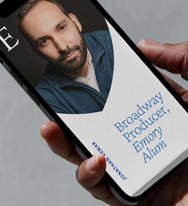
Vertical Typesetting/Logo
Setting small pieces of type vertically catches our audience’s eye and adds a bold element to layouts.
Unexpected alignment and balance
Nesting type and design elements with each other can use space efficiently but also create a slightly unexpected layout.
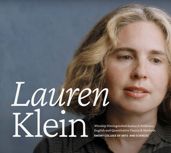
Base Anchoring
Anchor content to the bottom of a composition instead of the top or upper left corner.
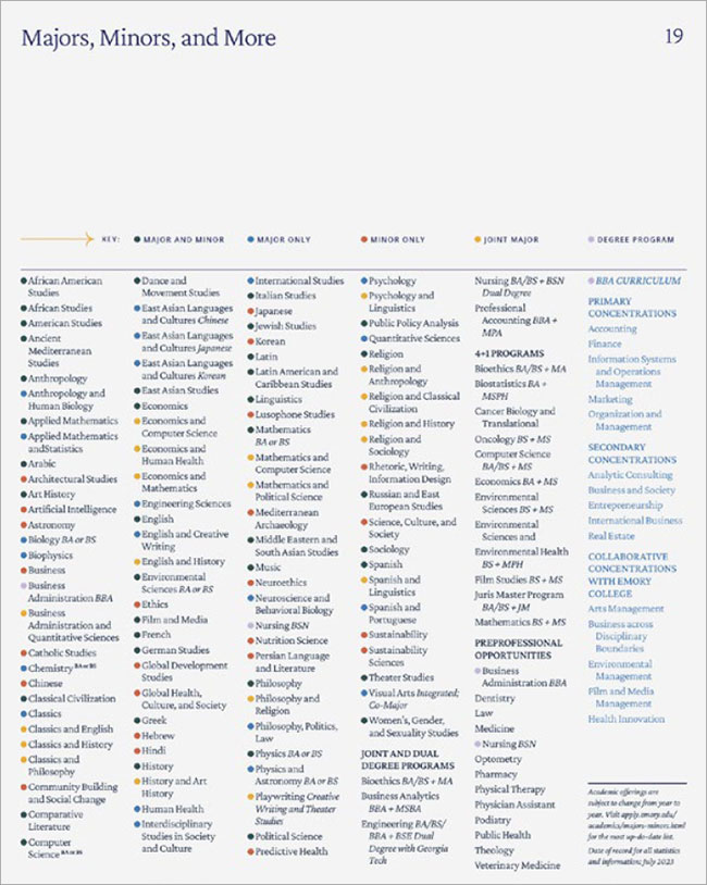
Inset type
Intentionally violating text boxes can draw attention to content that we want to highlight. This should be done minimally.
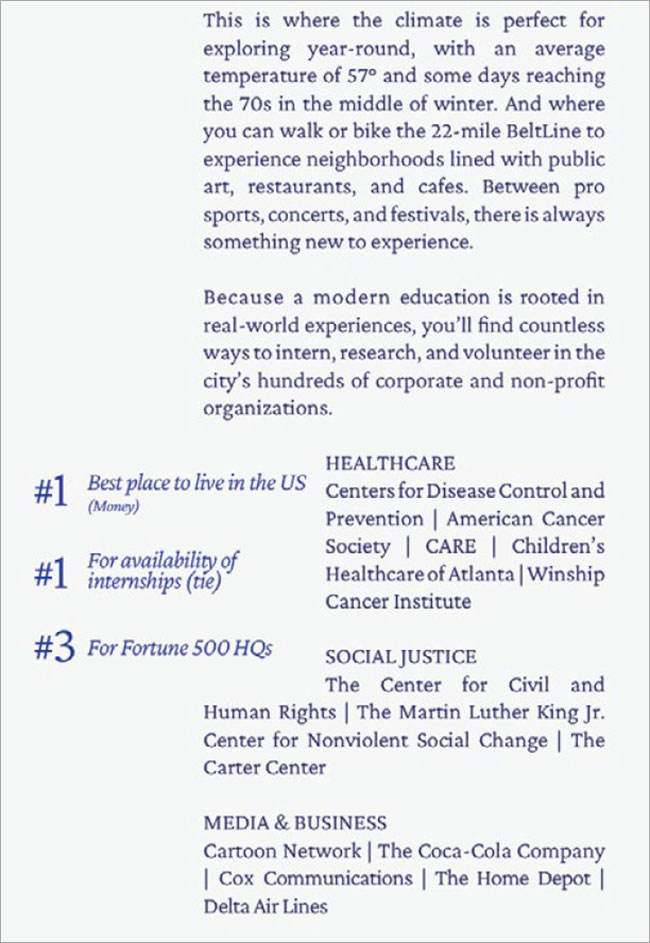
Inquisitive Don’ts
There are some definite don’ts we should keep in mind when adding curious elements.
Don’t create chaos
Our layouts are not chaotic or boundary pushing.
Don’t set long copy vertically
The use of vertical type should not impede legibility. It works best when applied to a smaller secondary piece of content.
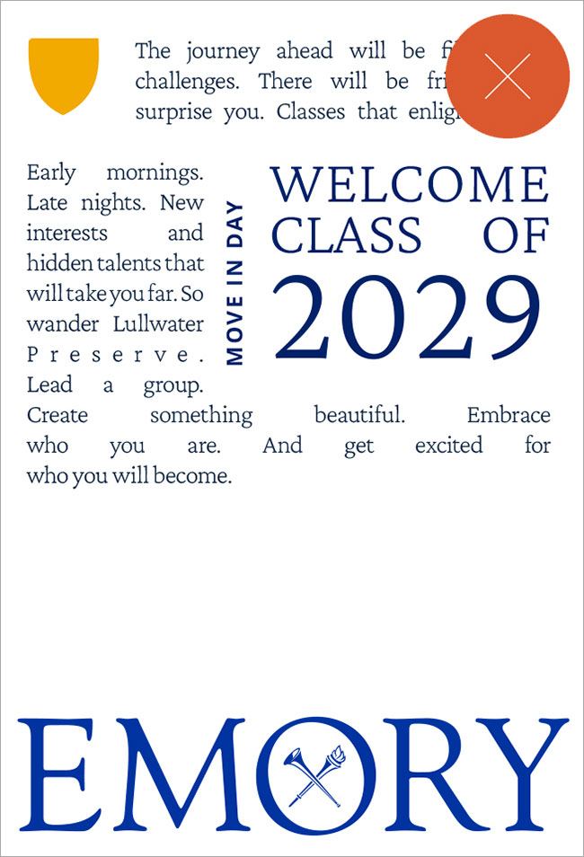
In this composition, there are too many competing pieces of interest that create a confusing hierarchy.
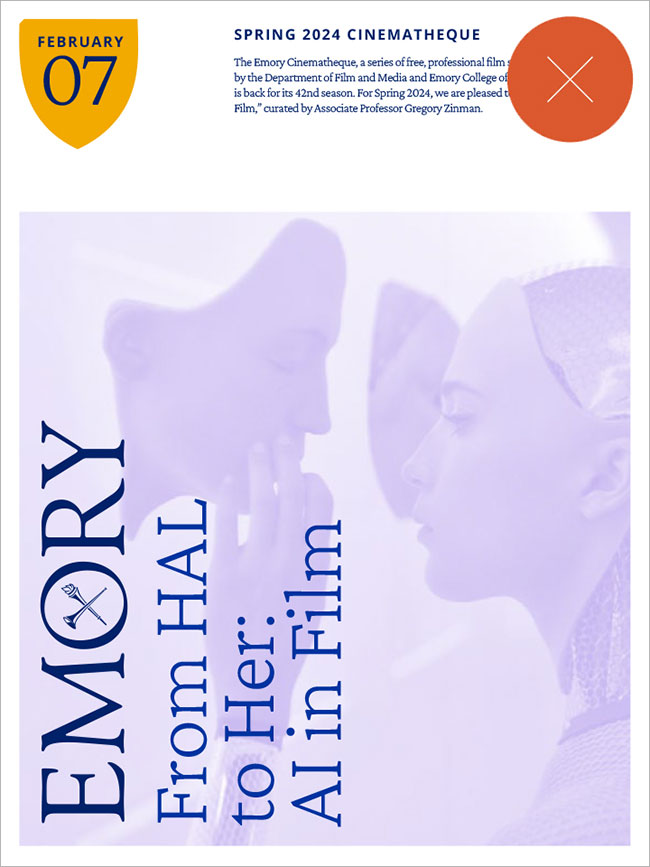
Setting both the logo and headline vertically causes them to compete for attention. Generally, we should only set one typographic design element vertically so this treatment doesn’t become overused.
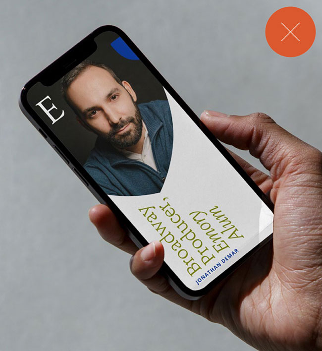
Setting the most important headline vertically makes it hard to read for our audiences. The vertical element should be secondary or complementary to the main focus and never impede comprehension.
Being Thoughtful
Every composition should begin with thoughtfulness. Be certain and confident in the purpose of your work before jumping into design.
Answering the following questions can help you make design decisions based on the goal and purpose of the piece.
- Who is this communication for?
- What purpose does it serve?
- Is it formal, playful, somber, academic, energetic?
- How will our audience experience this communication?
Quality design work features three things:
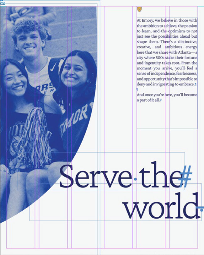
01. Design grid
A majority of Emory layouts will require a four- or six-column grid, but this can increase or decrease based on the size or the dimensions of the piece.
02. Using consistent hierarchy
Sticking to a clear hierarchy and repeating it consistently throughout a piece helps communication feel organized and allows our audiences to understand information more clearly. This is felt most significantly with typography hierarchy. The guidance on type style and hierarchy will suit a majority of Emory design work. Once a hierarchy is established in a piece, it should not change.
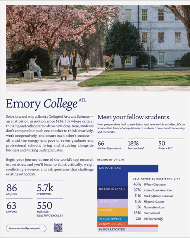
03. Seeking balance
Because our design system is based on airy negative space, we must rigorously seek balance among the elements within each composition.


Questions?
Contact the Communications and Marketing brand team.
emory.branding@emory.edu